Three ways to evoke emotion through your web site design
by Jess Kent-Woolsey, Design Enterprise Studio Member, March 2022
Emotions play an important role in our experiences. They paint our realities, guide decision making and draw attention. This also applies in the digital world when we design user experiences. How on earth can a digital screen provoke emotion, I hear you ask? That’s a valid question.
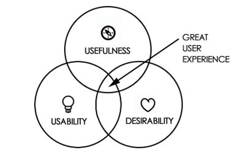
A good way to look at this is to divide the emotional experience into three parts: Usable, desirable and useful. Usable refers to the functionality, or usability, of the experience such as the navigation and information architecture. Desirable refers to the aesthetic elements that appeal to our visual and auditory senses, such as the interface, interaction and visual design. Useful means the experience satisfied a particular need and could do so again. A harmony of all three components can make the experience stand out from competitors and persuade users into becoming long-term customers.
Elicit emotion and lift your designs to the next level
In the following sections, I’m going to discuss three ways you can elicit emotion through this framework and illustrate with a personal example. Every client project you undertake will involve different target users, business goals and brand values, therefore every approach will need to be adapted to the demands of those factors. However, these three methods apply in multiple scenarios and, if applied in the right way, can take your user experience designs to the next level.
1. Flow experiences
Designing for the state of flow is an effective way to elicit a positive emotional response from your target user. Coined by Csikszentmihalyi, flow is described as being mentally and emotionally immersed in an activity to pursue a wider goal. After achieving this state, you are left feeling accomplished, confident and capable. In the UX of a website, we can facilitate the state of flow through functional (usable) and aesthetic (desirable) elements, such as:
- Providing evolving goals. When we design the navigation and information architecture of our websites, it’s important to structure it according to the goals of the target users. Evolving goals are incremental steps towards a larger goal that enhances the user’s sense of accomplishment and reward.
- Feedback. Designing a dialogue between the user and the website provides them with a sense of control over their interaction. It’s also an avenue to humanize the experience and communicate brand personality.
- Balancing a perception of challenge with the skillset of the user. Challenges that are overly simplistic are not engaging. Conversely, overly challenging experiences are difficult to use. Understanding the skills of the target user and designing an experience that meets their abilities will elicit a feeling of competence.
Let’s look at an example:
I once had a client who wanted a website redesign for her Tai Chi practice in Bristol. Her goals were to expand the business by gaining new corporate clients and students for her classes. After creating several personas of the target audience, I found a reoccurring user goal was “getting in touch with the teacher prior to attending one of her classes”. Therefore, one of the key means to help the user experience flow was to implement a feedback message after contacting the teacher via a form. This notified the user that they successfully sent their request. More importantly, the motion design and personalised message gave a sense that she was directly replying to them, adding a personal touch to the interaction and reinforcing her brand personality.
2. Personality
Establishing the personality/ values of a brand and communicating this through visual elements is another way to design for emotion. The visual appearance of a website is the first thing a user encounters and will make a snap judgement upon. An interface that is aesthetically designed with images, typography and text is more desirable, and is consequently perceived as more usable.
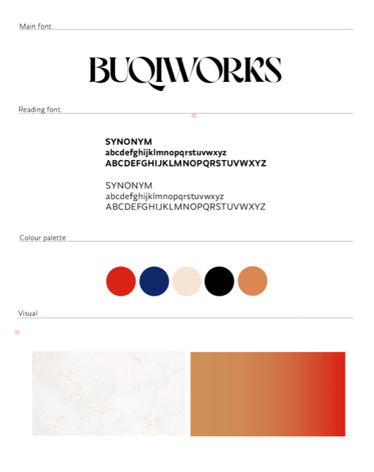
Let’s go back to the Tai Chi example: the teacher and her brand revolved around principles of Tai Chi, including balance, dominance, control, culture and spirituality. Before going on to prototype the website, I created a style guide to help manifest these qualities through visual design elements.
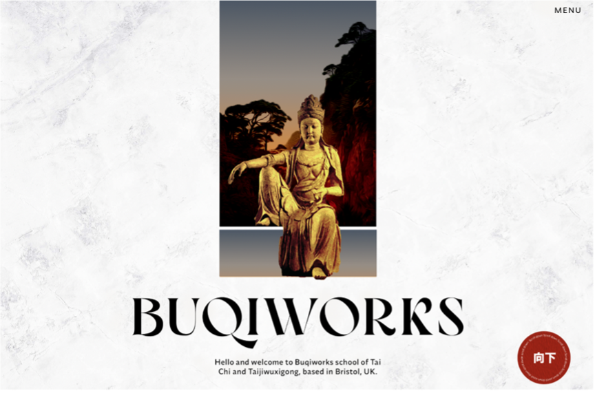
I then considered the context of the design: What is the purpose of this website? What role does it fulfil? A core purpose of the website was to convince users that the service was more attractive than others. This meant that the home page should act as packaging for her service, attracting users through eye catching visual elements. The environment behind the buddha is like a window into something new, rich and peaceful; that is what prospective students are seeking in trying out a new activity like Tai Chi.
3. Information design and typography
The design of information on a website is another impactful way of eliciting emotion. Again, this combines qualities that are usable (content, tone of voice) with desirable (typography, layout) to convey a message beyond the content itself. When this is done effectively, the user feels as though they are being directly addressed by the information.
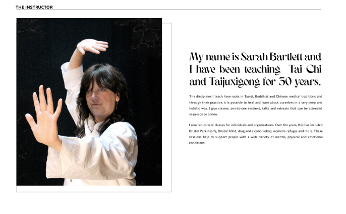
By hiring the Tai Chi instructor, new students and corporate clients are looking to embark on a new experience. Therefore, the tone of language should be personal, inspiring and motivational. Although the content itself was already written out, I was able to enhance the tone of the information through visual hierarchy, composition and typography.
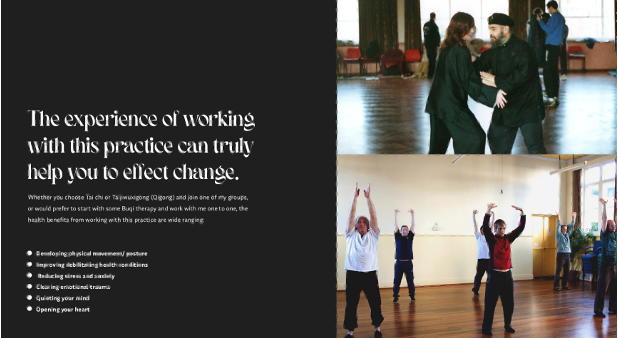
Hopefully, this practical example has convinced you that designing for emotion can make a simple web site into a fun and meaningful experience. It’s important to note, however, that there is no set rule book on how to make a usable, desirable and useful design: although there is guidance such as the examples I provided, intuition has a part to play in eliciting emotion.
Fear not! A thorough understanding of your users, the context of use and personality/ values of the brand are all breadcrumbs that lead you to designing an experience that truly resonates.

