Minimalistic brand identity, the backlash and the battle for accessibility
by Danila Gerasimovs, Design Enterprise Studio Member, March 2022
If you have been actively using the internet, social media or phone apps for the last two to four years you will know that feeling. You open an app or website and get an off-putting sense that something has changed. You can’t put a finger on it at first, but then it all comes together, the colours have are different, the logo, maybe even the font.
User backlashes against such changes echo through twitter, reddit and meme culture in general. In this article I want to reflect on some successes and failures of minimalistic logo re-branding, using some of the most well-known brands as examples.
“Old” minimalistic design
Of course minimalistic (or flat) design is not new by any means, it seems most areas of design, media, architecture, planning and even art have been heading this direction for much longer than a decade. Modernism, Bauhaus and Minimalism have mapped out the direction for most “visual things” that surround us to this day, well before there were such terms as “app” or a “web site”. For example, design guidelines set by the famous Bauhaus Art School about functionality, functional use of space, effectiveness via simplicity or ergonomics were adopted by many designers and through their hands many companies ended up with minimalistic designs much earlier than just the last decade.
In pursuit of a better representation
many global brands adopt the flat design: Apple used a flat design logo for most of its time on the market, as far back as 1977. McDonalds stayed minimalistic and used simple forms since 1960, only changing it slightly throughout the years. And Nike’s last logo change happened 26 years ago, which was the removal of text. One reason for these logos being so successful is that they are rooted in the aforementioned principles, which makes them easy to memorise and reproduce. In this way, simple logos can help to communicate their brand’s ethos very efficiently.
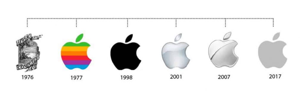
From the illustration above we can see that Apple has opted in and out of the flat design multiple times, but the reason for that might be easy to understand. As a leading tech company, their visual representation has to communicate technological advancement. And so for example, during the era of rapid popularization and accessibility of software editors that could render more and more complex graphics, it does not seem surprising that the logo acquired a “dimensional” upgrade in 2001.
The key factor of any logo is representation, if it doesn’t represent the idea put behind the brand, it does not work. A good example of brand re-work would be twitch. Although it was received with mixed feelings by users, reading the website dedicated solely to twitch’s recent re-work of logo and colours it is easy to understand why this game streaming platform wants to be preserved colourful, creative and emotionally positive.
Negotiating brand accessibility and consistency
The recent re-works of the Firefox and Discord logos have been widely talked about on the internet. Although both were blamed for applying the complete opposite of the principles described in previous paragraphs, I think we can actually see a genuine desire for improvement. As explained by Discord, some elements of the old logo were very hard to print, the font was not up to readability and accessibility standards, and actually the logo wasn’t even symmetric! And Firefox, pushing for a multiple app framework such as Google, wanted to unify their products to make them recognisable as a family of products. Easy to understand but perhaps we lost something along the way…
Can a logo lose personality?
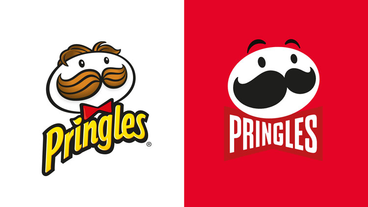
You pick up a Pringles can, one of the most well known (and in some countries quite expensive) snacks at a grocery store. On the packaging you see a moustached man with glow in his eyes as if anticipating the snack, maybe even more than you yourself do. But what happened to him? He became so minimalistic, gone bald and lost all energy, with eyes having gone completely black.
To me, there seems to be a common theme in these unfortunate re-makes and re-brands. Discord lost its playful smile, the earth in the Firefox logo became so unrecognizable that people who had not seen that logo before wouldn’t recognise it as such. Loss of emotional connection is almost always perceived negatively by users, and so there will be little gained by changing a logo if users feel their favourite brand has gone ‘cold’ on them.
Surely, minimalism can be achieved and strived for while preserving the context and identity of the brand, not by sacrificing it for the sake of visual reduction. The best way to preserve the uniqueness of a given logo must be to understand it from the client’s and users’ perspectives. The design team needs to talk through the brief in detail with the client but also try to understand what a particular logo or brand means to a loyal consumer group that took a dedicated marketing team years’ to grow.
References:
https://art.art/blog/10-bauhaus-principles-that-still-apply-today
https://trends.google.com/trends/explore?date=all&geo=GB&q=%2Fm%2F06710
https://www.tailorbrands.com/blog/apple-logo
https://blog.logomyway.com/mcdonalds-logo-history/
https://www.designweek.co.uk/issues/20-26-september-2021/pringles-rebrand/