Minimalistic Brand Identity
Minimalistic brand identity, the backlash and the battle for accessibility
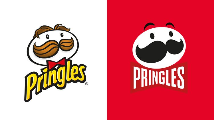
by Danila Gerasimovs, Design Enterprise Studio Member, March 2022If you have been actively using the internet, social media or phone apps for the last two to four years you will know that feeling. You open an app or website and get an off-putting sense that something has changed. You can't put a finger on it at first, but then it all comes together, the colours have are different, the logo, maybe even the font. User backlashes against such changes echo through twitter, reddit and meme culture in general. In this article I want to reflect on some successes and failures of minimalistic logo re-branding, using some of the most well-known brands as examples.
“Old” minimalistic designOf course minimalistic (or flat) design is not new by any means, it seems most areas of design, media, architecture, planning and even art have been heading this direction for much longer than a decade. Modernism, Bauhaus and...